New Minimalism: Update your Shop for 2017
A common New Year’s resolution is to get more organised. This can take many forms, such as organising one’s personal and professional accounts, files, emails and more. Others may focus on getting rid of, or storing, excess inventory. Still others may simply want to decrease miscellaneous clutter.
Whatever the goal, learning about minimalism will help change the way you think about objects, space and colour. A minimalist’s motto is: “Less is more.” With that in mind, here are some useful ways you can integrate a minimalist approach in your shop, giving it a fresh look for 2017.
Carefully manage your stock and stockroom
Stock one of each product while considering its colour and size run. For example, if you carry a style that comes in three colours (white, black and grey) as well as three sizes (small, medium and large), you should have nine items on your floor. Repeating items ought to sit in your backstock. Replenish your display as articles are sold. Additionally, this best practice can potentially reduce theft in your store: you are better able to see and keep track of what’s there with fewer items out.
Finger spacing
While it can be harder to maintain for busier shops, finger spacing your goods creates a pleasing visual impression of symmetry and proportion. For displays with e.g. clothing and hangers, consider the nature of the display itself. It may be a peg that juts out from a grid, or a rail attached to a grid. Position the first hanger at one end of the display. Then, depending on the length of the display, place one to five fingers between each hanger, with the palm vertically oriented.
Create white space
Using white or clear visual merchandising accessories like hangers, shelves, pegs, rails, grids, etc. ‘opens’ up your shop’s interior, making it easier on the eye. Darker colours, on the other hand, break up a larger visual image, creating a more cluttered feeling.
Select your colour scheme
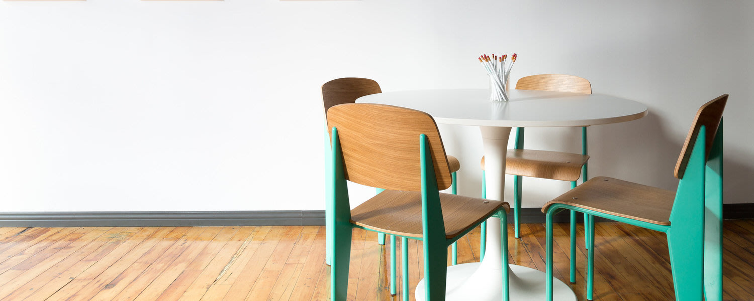
Choose two or three main colours to use within your store’s visual merchandising. Earthy tones of wood are a popular choice, along with white and grey. Consider using one accent colour among neutrals, like green. For example, a shop may have some plants as well as a green bench, light fixtures and changing room doors.
Choose simple furniture and fixture designs
When shopping for furniture and fixtures for your shop, look for solid colors and clean lines. Long shelves are a great way to maximise your vertical space while elongating the appearance of your shop. Maintain a sense of cohesion with square or rectangular display cases.
Leave room to breathe
Arguably nothing is more unpleasant for a shopper than a cluttered shop. Narrow isles with inventory spilling over the shelves can cause some customers to immediately leave, not wanting to navigate through groups of other customers nor dig around for the product they desire. Leaving space in the main or center aisle is especially important: shoppers who are browsing will gravitate towards there to pause and consider things at a distance.
